Diamond Conference Identity
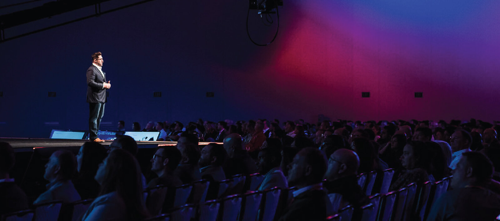
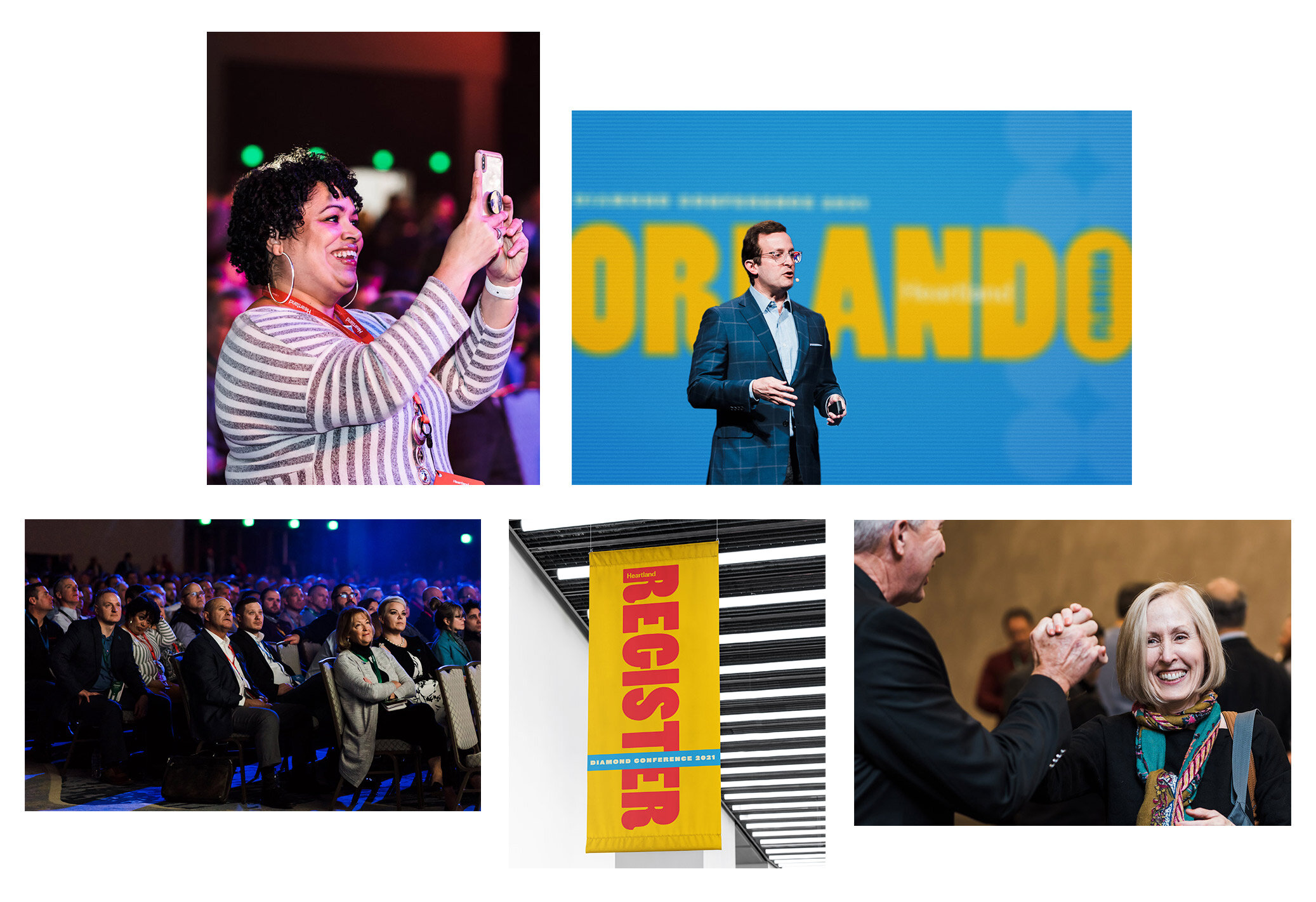
Held annually in different cities across the US, Heartland's Diamond Conference is one part Apple Keynote, one part Ted Talk, and a dash of local flavor reflective of the host city (experienced through corporate excursions). The Diamond Conference is Heartland's biggest internal event of the year, and is reserved for those who earn their way there-either through sales numbers for those in the sales field, or corporate milestones for those in the office. It is seen as a professional win for those who get to attend.
For Orlando's Diamond Conference, the challenge was to create something bold and reflective of the local climate of the region, while not infringing upon the rights of a certain litigious mouse.
Client: Heartland Payment Systems
Industry: Financial Technology
Role: Brand Strategy, Identity, Brand Guidelines, Print

The Brief
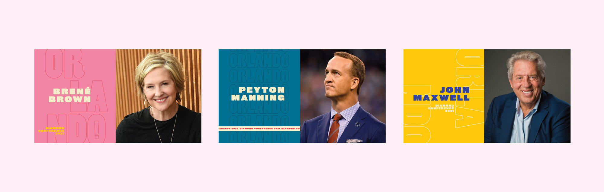
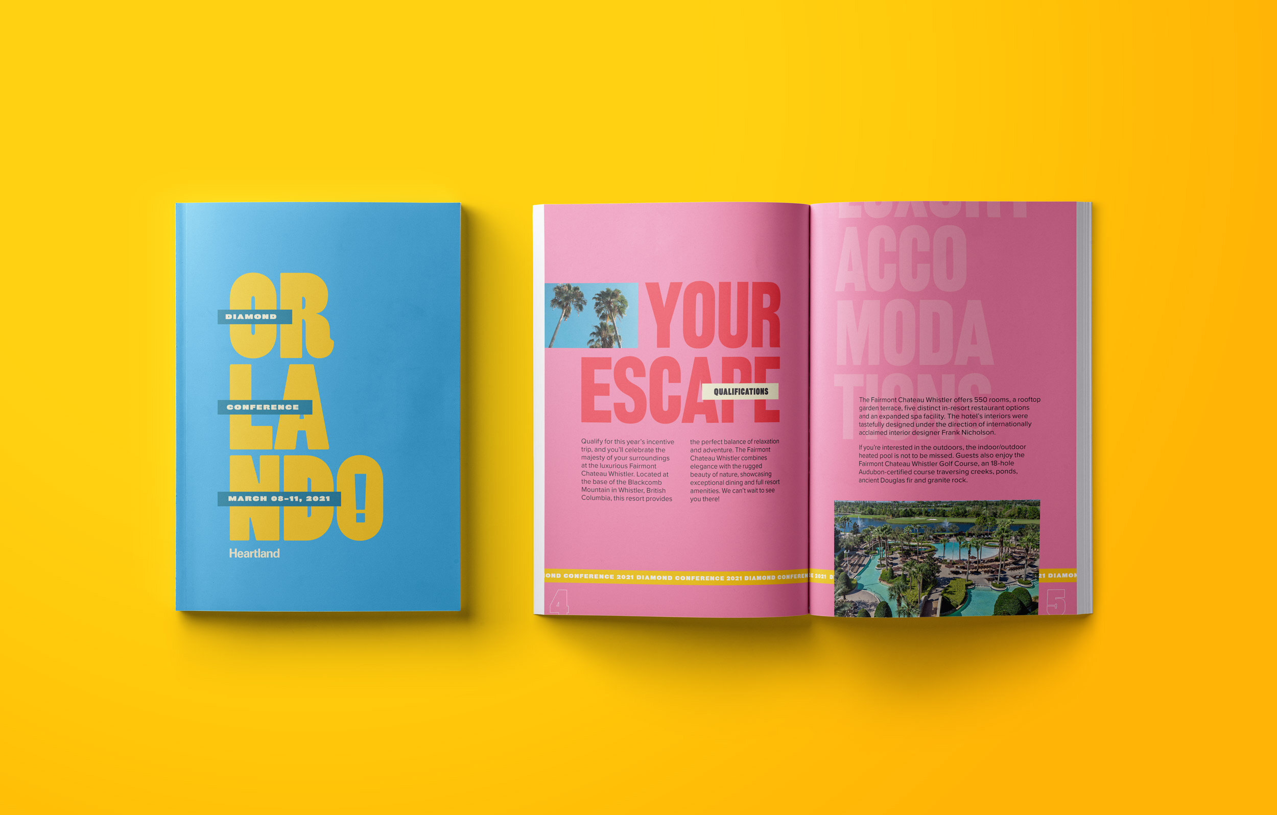
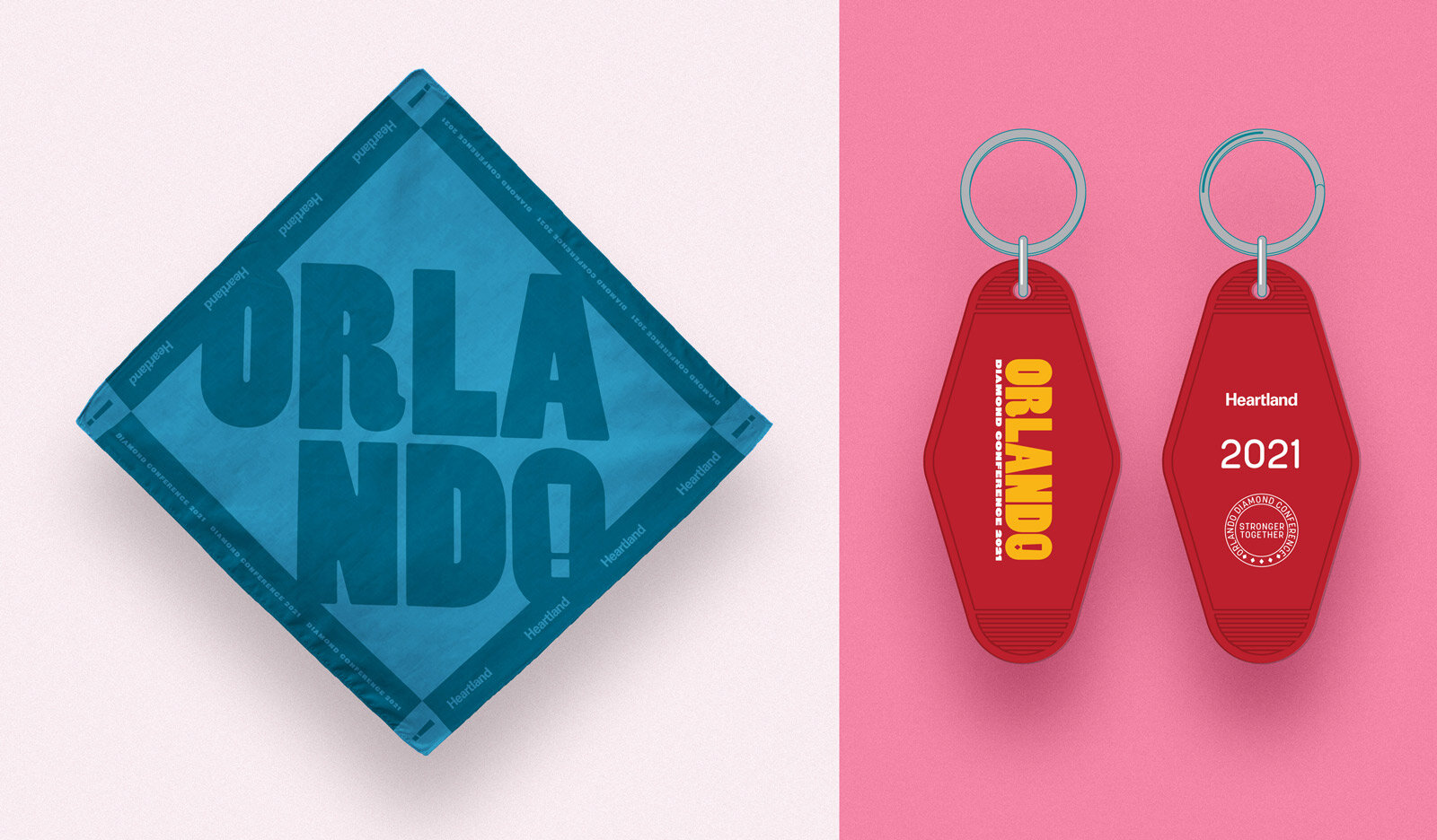
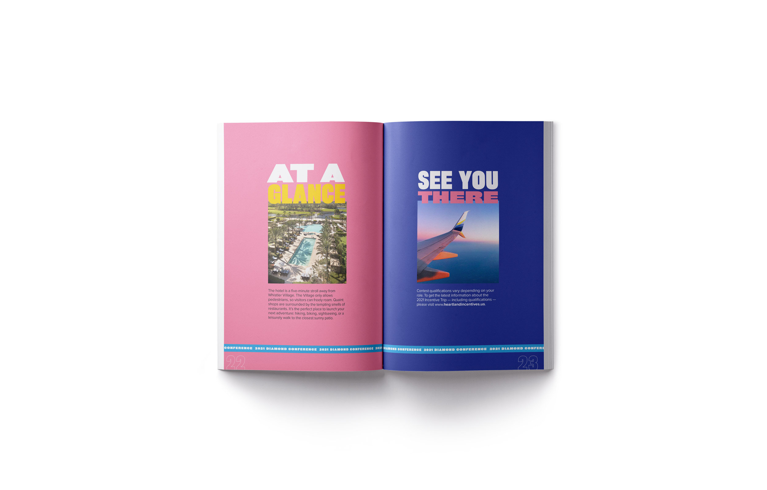
To create an identity system that could be implemented throughout various touchpoints for a full year leading up to the event. The branding would come to life through swag items, hype videos, promotional mailers, and presentations, to say nothing of the branding at the event itself.
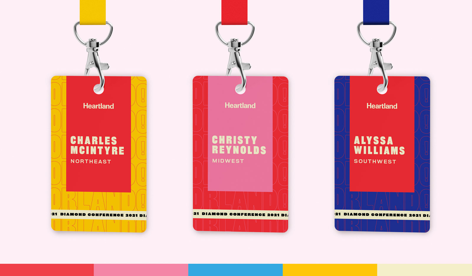
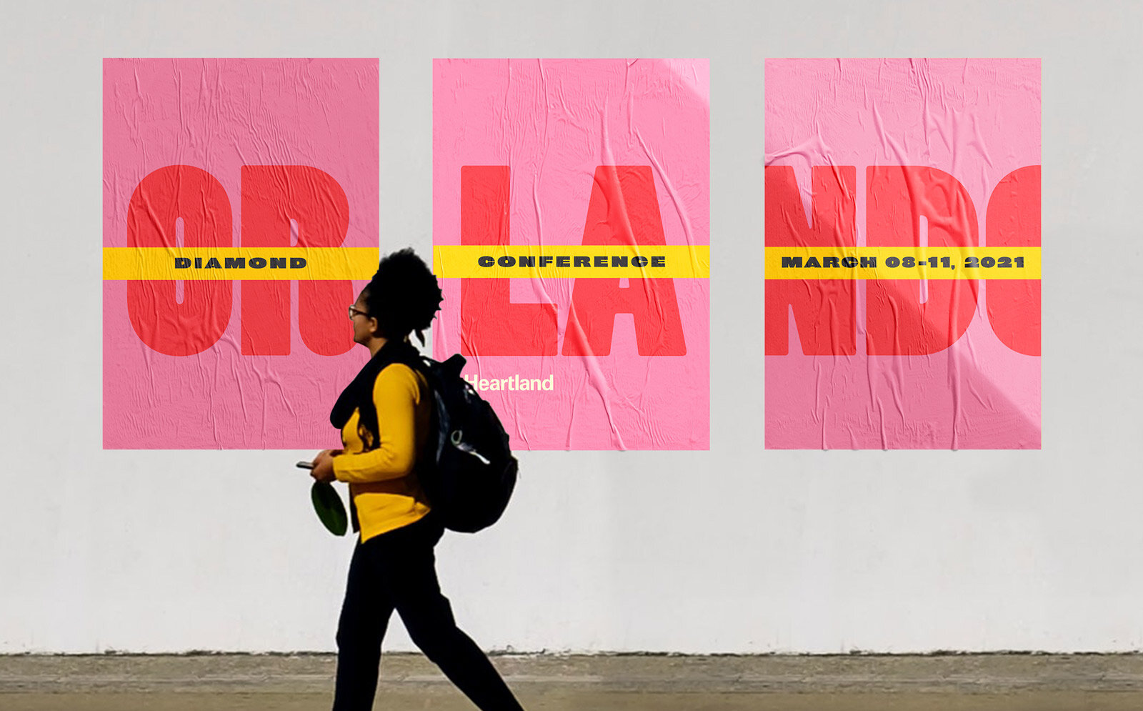
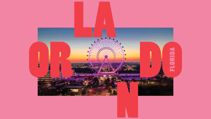
Through conversations with the client, we determined that the branding needed to be bold and different from the previous year's Diamond Conference branding in look and feel. We decided to make the location itself the primary element in the branding through the use of bold but playful type and bright colors.
My goal was to create an identity system that had elements that could be used in somewhat agnostic configurations since the scope of this project was so broad and deep. I wanted the audience to make the connection that the piece they were interacting with, whether a branded keychain or a brochure outlining the trip qualifications, would be both consistent with the brand and also not identical to previous touchpoints. I wanted to keep it from becoming overly familiar across the year or more that the audience would be interacting with it.
The Process
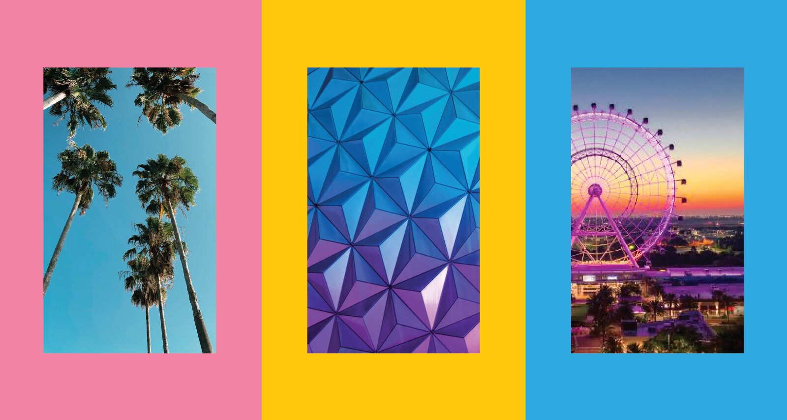
The research phase of the process consisted of deep dives into the city of Orlando. Its culture, its individuality, and even its history. I latched on to its "mainland tropical" contradiction, bright colors and both art deco and mid-century influences. These guided my initial concepts for design. I wanted to avoid any overly specific iconography or illustrations, and instead tell the brand story primarily through unique typography, color, and unique photography.
I initially concepted out 3 different directions and presented them to the client, along with another designer who did the same. We went through several rounds of revisions before arriving at the final direction reflected below. Interestingly enough, this was the boldest option I presented in the pitch meeting! It was a "wildcard" option that I concepted out because I was a fan of the bold typeface and all of the ways that the typography expresses itself through extreme thicks and thins. Rarely do I have a favorite option when presenting to a client, and even rarer that the client wants to move forward with it, so I was pleasantly shocked to hear that this was their pick as well!
Unfortunately, because of COVID, the event itself was cancelled, but it lives on here.